Financial Charts
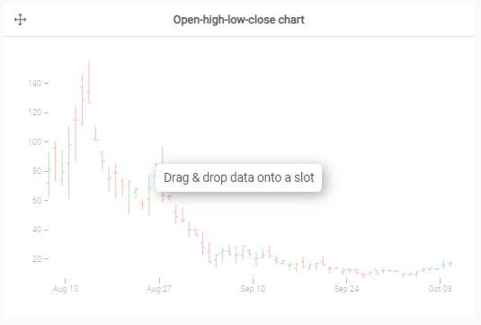
Encodes data using height and often color to show increase and decrease between time periods or categories. Mainly used for financial purposes but could be used for other purposes too.
- Show an evolution of a calculation of a measure (over time) for limited number of elements.
- The order plays a role.
- Could be used to show calculations such as the EBITDA or show the evolution of a measure over time, such as the number of active consumers (not opted-out) per month over a year.
- Data preparation: When using this chart, it is recommended to have a dataset that contains 2 (or 4) measures displayed as such:
- LOW-value, OPEN-value, CLOSE-value, HIGH-value
- OPEN-value of a day = CLOSE-value of the previous day.
